Make users notice, read and understand error messages and instructions.
UX design, UI design, UX copy, UX writing, Design guidelines setting. Consultant work through Nameless Today / Above Agency. 6 months.
Client: Aktiebolaget Trav och Galopp – the cooperation company for horse betting under the organisation Swedish Trotting Association. I worked in two teams: One with control over payments and anti-money laundering, one with the responsibility for the main webpage.
Responsibility areas: The webpage team needed a new layout for the news pages, a chatbot and a cookie consent modal. The payment team needed overhauling in the user flows for deposit/withdrawal and on the betting limit pages.
Task: Improve various pages’ and flows’ copy in instructions and error messages, in order to decrease customers’ frustration from not having understood certain rules and limits.
Solution: By moving parts of the copy from body text into alert boxes, and evaluate what information needing to be above fold, we created better possibilities for important information to be read, thanks to an alert’s ability to get attention.
Disciplines applied: UX-design, UI-design, UX-copy, UX-writing.
Tools & Methods: Figma, Hi-fi prototyping, User Interviews, User Journeys, Usability Testing, Information Architecture.
Team: My teams consisted of FE- and BE developers, QA testers, Product Owners and a UX intern whom I guided. I had cross-collaborations with ATG’s legal division to make sure the UX writing was aligned with their anti-money laundering work and GDPR.
Creating value at lowest cost possible
Due to the client’s restrained budget, I needed to be creative in how I could improve the UX copy and design in short time and less money spend. There was a challenge in not having the financial resources to set up tests with users for pin-pointing the unclear copy or for testing the new one, and in not having any test account set up for me to investigate things myself.
Under these circumstances I did the following:
— quick visual changes: I suggested moving body text parts into alert boxes since these boxes are components we already have today and are using at some places. According to the style guide, the copy in an alert box can be turned into bold text, so we used this opportunity
— no money for usability testing: I asked the person from the customer service, who was in charge of letting my team know our users were having trouble with these flows, to “create an event” on these pages in order to follow up how they are performing after our changes
— knowing what copy to change: I discussed the information and error messages with colleagues who are non-Swedish speakers but understands some. I tried to figure out what in the text that made it tricky to understand.
Feedback from the team
“She is never too proud to make changes in her design”
“A skilled presenter and natural speaker”
“Her main focus is to ease everyone’s work and to contribute to the company’s prosperity”
“She discusses the problem with everyone in the team, wanting to hear the point of view from all skillsets attending”
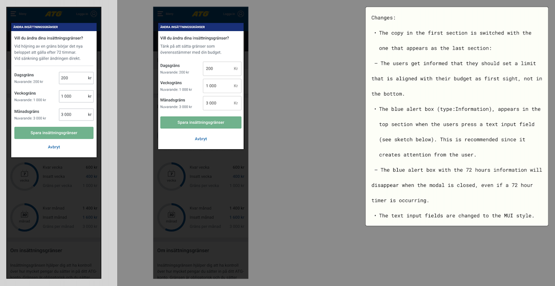
Problem: The customer doesn’t notice the information about increased deposits turning valid after 72 hours.
Solution: The information got removed from its original place and got visible in an alert box as soon as the value in the text input fields got changed.
The left screen shows previous version
Problem: The customer gets frustrated by the save-button not turning enabled although having changed a deposit limit.
Solution: The error message is instead being shown in the same viewport as the save-button
The left screen shows previous version
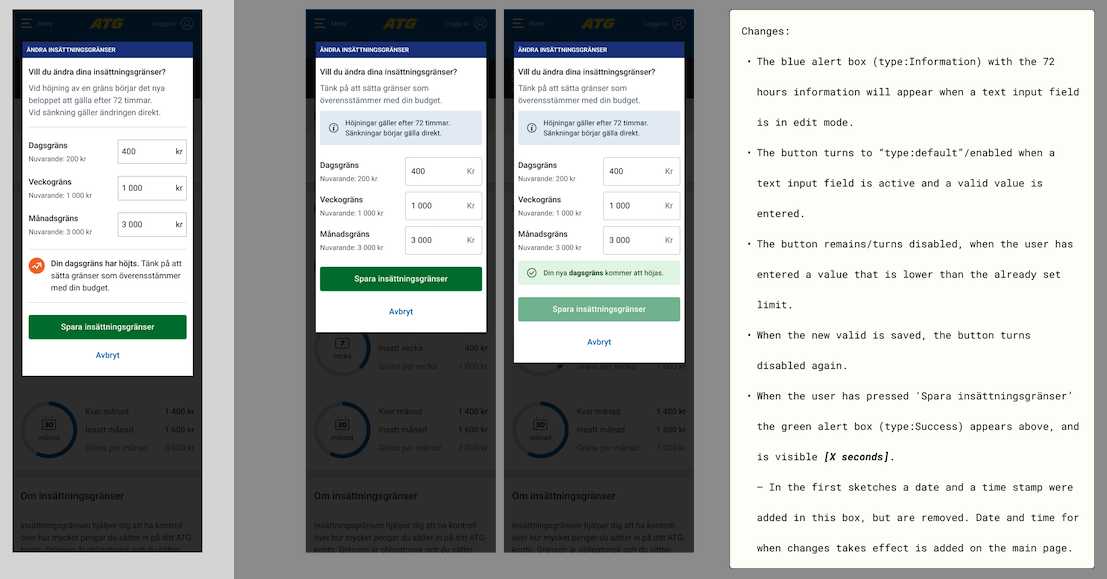
Problem: The customer is used to get a success state in the same viewport as the save-button, but this would not automatically be included in the moving of the 72 hours information.
Solution: The success state appears in an alert box in the same place where the customer is used to see it.
The left screen shows previous version


