from 500.000 to 700.000 paying users during a year.
UX lead, UX design, UI design, UX copy, UX writing, UI component library building. In-house work. 13 months.
Client: The book publisher Bonnier’s audiobook streaming service BookBeat, available in 10 markets and offices in Sweden, Norway, Finland, Germany and Poland.
Responsibility areas: The UX work on the web, including landing page, campaign landing pages, my account pages, book browsing, category lists, search page, buy and redeem giftcard, static pages, the sign-up and cancellation flow and the student offer campaign page.
Disciplines applied: UX-design, UI-design, UX-copy, UX-writing.
Tools & Methods: Sketch App, Hi-fi mockups, User Interviews, User Journeys, A/B-testing, Information Architecture.
Team: I was a part of the Conversion team, the Design team and the Web team. I worked closely with FE- and BE-developers, CTO, product owner, art director, designers, CRO-specialists, QA, marketing specialists and the brand director.
Achievements:
• Improving the UX design for pricing and cancellation offers, the gift card-, sign-up- and cancellation flows
• Improving the UX writing and UX copy in different informational contexts in the Swedish and German market
• Rewriting error messages
• Creating campaigns
• User interviews for evaluating a ‘Follow book series’ feature
• Setting up A/B-tests for colour usage
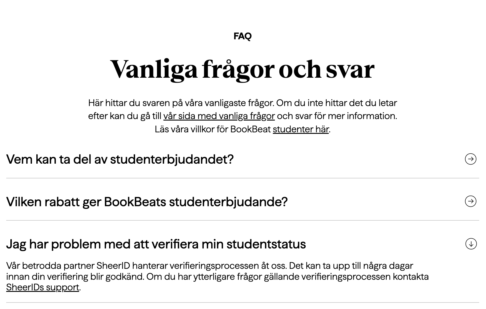
• Creating a student offer with campaign pages with collaboration with SheerID in the US
• Supporting the developers when creating a new UI component library, for implementing a new graphical identity
• UI design on the landing page, gift card page, my account pages, the sign-up page and on various static pages
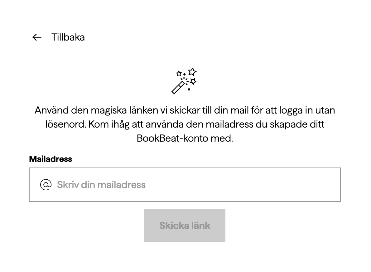
• Creating a new flow for a password-free login
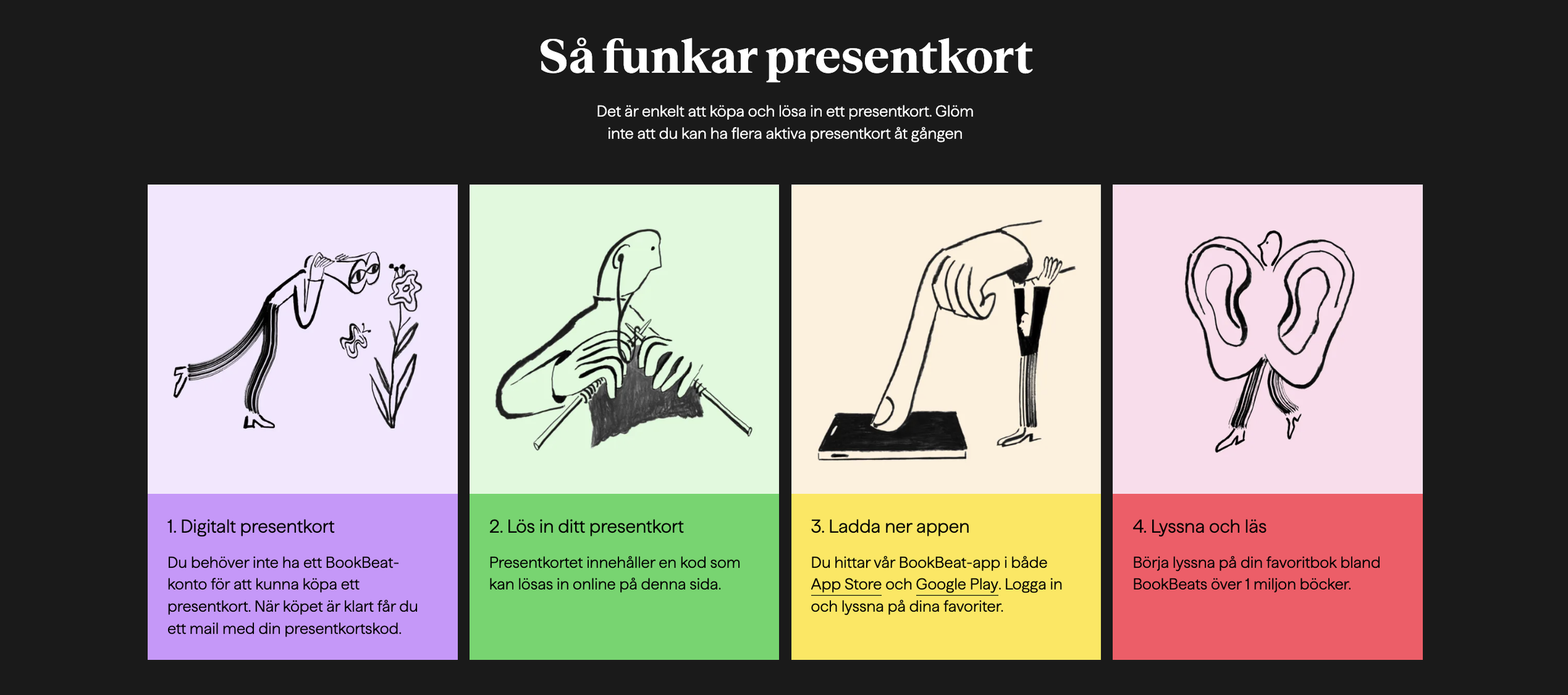
Gift card instruction
Gift card purchase
Changes:
New set of colours from the graphic identity to frame each step, links to app downloading and clearer copy regarding the gift card being digital
Changes:
Letting the colours from BookBeat’s listening-time packages appear in the same way when choosing gift card value
Unfortunately I don’t possess the interfaces for how they looked before 2021
Left: A new login interface
Right: New magic-login feature
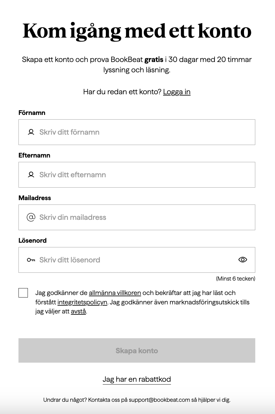
Changes:
Using hints in all of the text input fields, and displaying links with underlined text instead of coloured and bold text – these changes were made throughout the entire web as a part of wanting to provide a more accessible streaming service
Unfortunately I don’t possess the interfaces for how they looked before 2021
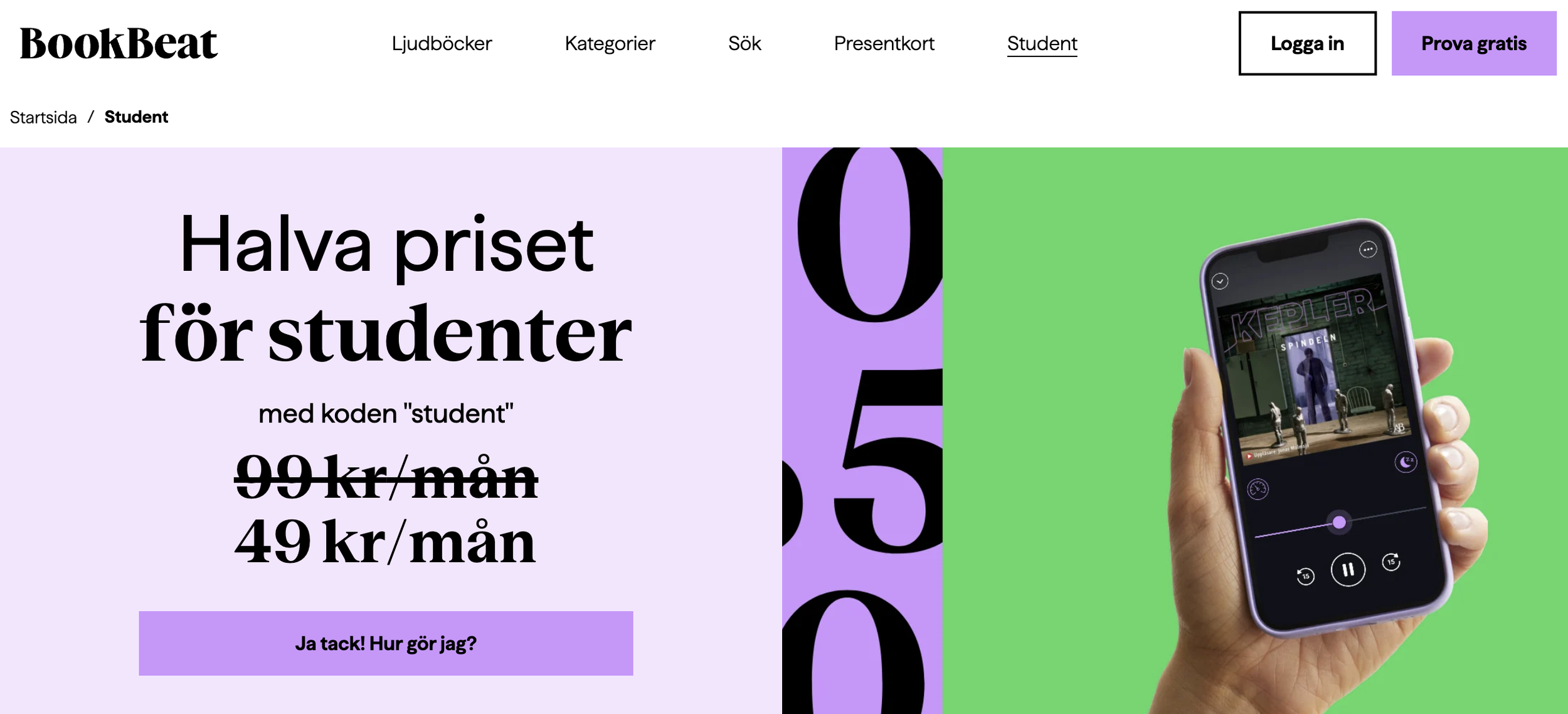
Creating a pricing offer for students
• Collaboration with SheerID as our partner for separating educational email addresses as valid for the code
• Working with marketers and art directors to design a campaign landing page
• Researching and working with customer support to create the right UX copy
• Solid work with QA-testing


