Enhance both user engagement and brand perception.
UX design, UX research. Consultant work through Nameless Today / Above Agency. 3 months.
Client: POC Sports (Peace of Cake Sports) – a leading manufacturer of helmets, eyewear, body armour, apparel and accessories in snow sports and cycling. Developing products of unquestionable quality and relevance, to protect lives and reduce the consequences of accidents.
Problem: POC Sports needed assistance in elevating their e-commerce platform to boost sales and enhance both user engagement and brand perception: The e-commerce platform must be improved and stay functional, without compromising the brand’s mission.
Challenge: Balancing the wish for the site to appear as a high-tech blog, with the need to inspire users to explore the categories and find more products to buy.
Solution: An optimised user journey and a more intuitive navigation to guide users through a seamless shopping experience, an enhanced mobile design for customers on the move, that simplifies the purchasing process and a product browsing experience with the brand’s story interwoven.
Disciplines applied: UX-design, UX-research.
Tools & Methods: Figma, Hi-fi prototyping, User Interviews, User Journeys, Usability Testing, Information Architecture.
Team: Ellen-Drake Kaiser and Camilla Jansson (UX), Mattis Forsman and Tom Eriksson (Visual Design), Ali Hamsis (Design Director), Damien Smyth (Analytics Director), Johan Simonsson (Product Director), Peter Nilsson (Tech Director)
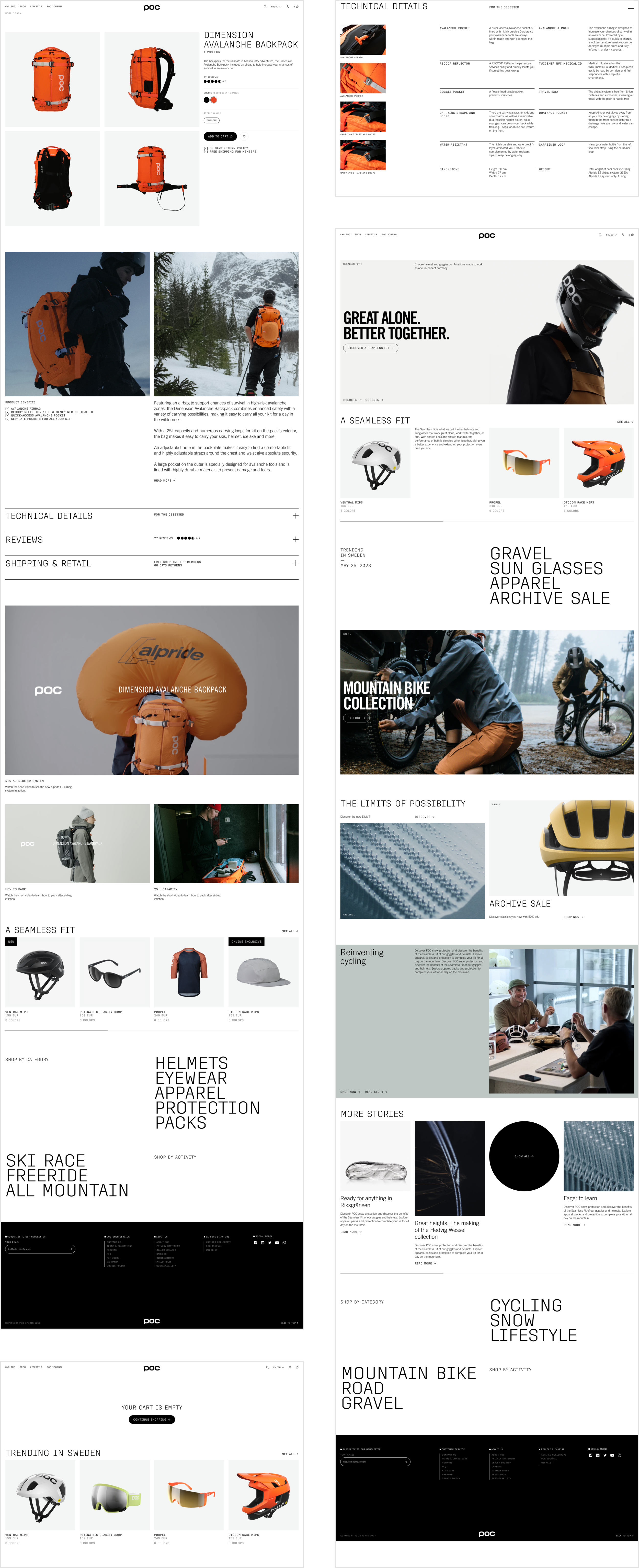
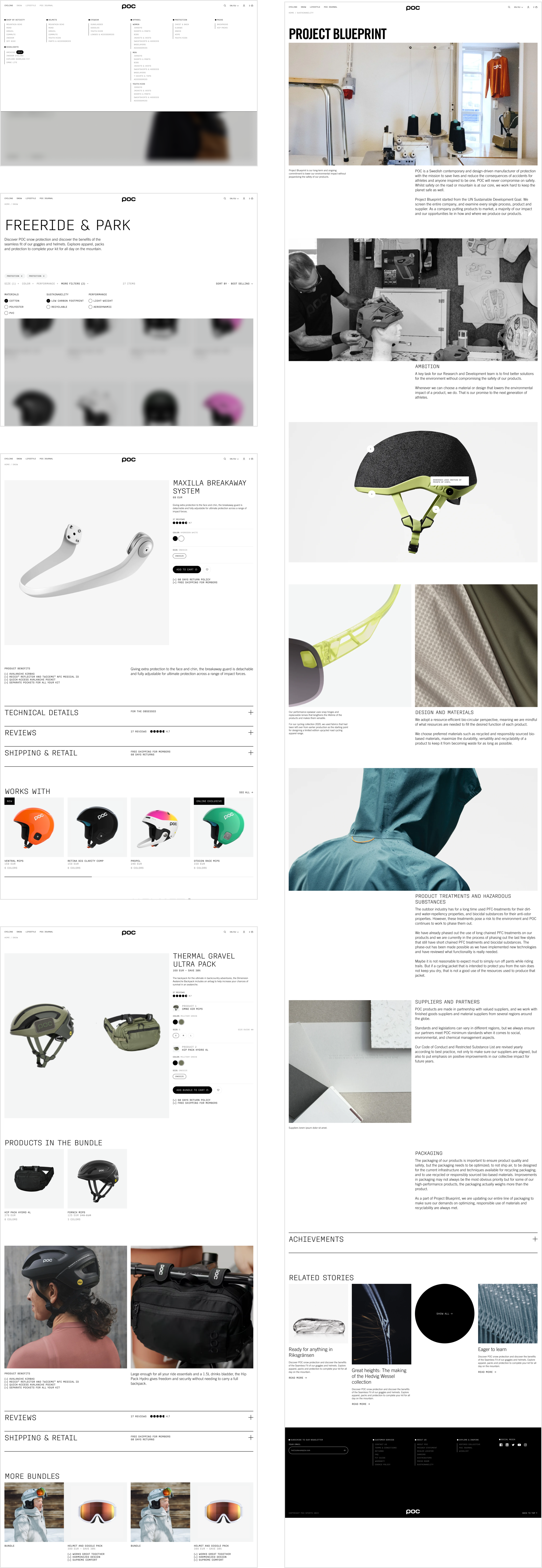
The final UX sketches
— handed over to the design director and the client, for them to follow the thoughts through the UX work, seeing to the needs of users and business
— handed over to the team of visual designers, for them to get a template to fill with the modernised visual expression components
— handed over to the tech director, for the completely new infrastructure to get their front end elements
Setting priorities with the client
Together with the client we made prioritisations on what pages to be redesigned first, as we went along designing. Our final conclusion ended up being start page together with the pages for product category and product details – since this is where brand and product can shine together. A thoroughly UX work was put on the following pages and states as well:
— cart: promo code not valid, added to cart, empty cart, bundle in cart, quantity over stock, previously added product now unavailable, cart in logged-in state, free shipping reached/not reached
— bundle products
— filters
— wishlist
— out of stock
Some of the visual design frames
⇩


